Kerning and Leading are ways to manipulate the spacing between characters. Spatial manipulation in type can be a very important tool. Some fonts need to have individual characters adjusted to help create better readability and a more aesthetically pleasing layout. Changes to kerning and leading often go unnoticed, but in most situations that is what the designer will only want a subtle change that fixes readability.

Leading
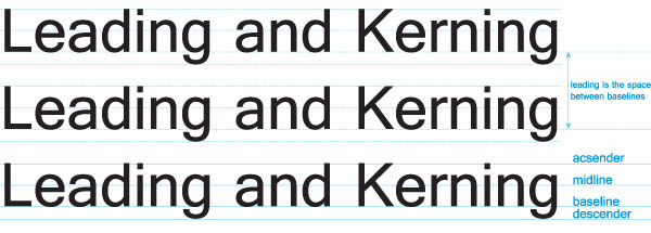
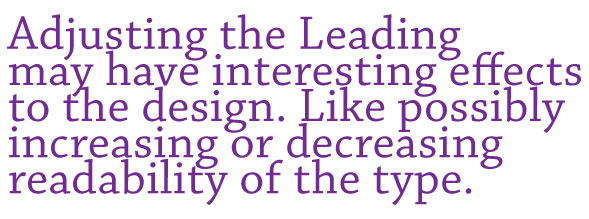
Leading is the spacing between the baselines of type. The term leading is derived from the practice of placing lead strips between lines type on older hand set printing presses such as a letterpress. Adjusting the leading is also a very useful way of saving or using space on a page. Leading can also be used to change the aesthetics when dealing with a typographical design. 
Kerning
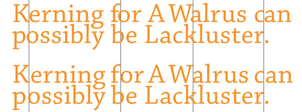
Kerning is the spacing in between individual characters. Most fonts will have specific default kerning for individual character sets so that the spacing in between the letters in words feels more natural. The image below has a sentence with and without custom kerning applied in 5 different spots to show how subtle the change is. Most of the time, people will not realize that kerning was included to change the type of the design.

Tracking
Another adjustment to type that hasn’t been mentioned is Tracking. Tracking is very similar to kerning in that it is the spacing between individual characters, but tracking is the space between groups of letters rather than individual letters. Tracking affects the overall character density of the copy. Other than the actual effect that it could have on readability of type, tracking would be used to make lines of type even. Tracking will help to eliminate widows and orphans in paragraphs. Widows are when the final line of a paragraph begins a new column or page. Orphans are when paragraphs end in single words, part of words or a short phrase that seems out of place.
![]()
Kerning and Leading are important in typography and should not be ignored. It is the finishing touch on the type that makes everything read and flow properly. The design is not really complete until kerning and leading have been considered, but that doesn’t mean that they are always necessary. It shouldn’t be forced upon a design, but it should look natural.


6 Comments
Sini Pelto
December 2, 2019The explanations of kerning and tracking are partly mixed here.
Kerning is the space between of two characters in a piece of text.
Tracking is the space between individual characters (characters in general). There are loose and tight tracking (space between letters vary significantly between those, in general).
Parts from original text:
“Kerning is the spacing in between individual characters.”
“Tracking is very similar to kerning in that it is the spacing between individual characters, but tracking is the space between groups of letters rather than individual letters.”
Andrea
May 20, 2016What’s the Font in the first Graphic?
AMANDA VON LOHRMAN
October 8, 2014Thank you! Very useful information!
Giovanni
September 13, 2013Adrienne, that is great! We love to hear that our content is helpful and feel free to share the article with your class! Don’t forget to sign up for our newsletter to stay up to date on new articles.
Adrienne Grace
September 12, 2013Thank you! I want to share this link with my beginning InDesign class. This is a nice description and good visuals to help clarify.
[BLOCKED BY STBV] Class 50.0 (Tuesday, February 2012) « TGJ2O Course Page
February 28, 2012[…] Leading: Vertical spacing between text […]