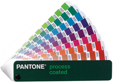
In this article I would like to talk about the Pantone Matching System (PMS) and its various uses. For those of you who are not familiar with the CMYK and PMS color processes, please visit our infocenter pages to learn more about the Pantone Matching System (PMS) or our page on CMYK and color separation.

Pantone Colors and Branding
Now, just about everyone in the world is familiar with Coca-cola print ads and the use of the color red in its branding. What most people might not realize is that the red is a specific color “tint” that is used consistently throughout Coca-Cola’s advertising, a variation between PMS 484 and 485 although no specific Pantone color is specified (CMYK values can vary as well). This “Coke Red” color is claimed as “a feature of the mark” as written in Coke’s trademark with the USPTO.
In some cases, differences between a logo’s use of color or symbols (including type) as it applies to their memorability do exist and can lead to a hefty discussion. In my opinion and in this case, Coca-cola has made great use of both color and symbol (type) to leverage “Brand Stickiness”.

Color and Purpose
Establishing a color scheme before starting a print project is key to providing the client with the most effective design possible. A logo for example, should be easily printable in either color or black ink only. Budgets and the purpose of the print can vary and will affect how the logo will be printed. When printing an NCR Form, the difference in price between full color (CMYK), PMS colors or black ink only can be quite significant. Most NCR forms are used for record keeping such as receipts, not as a marketing piece. Therefore, having a full color logo printed on an NCR Form might just be a waste of money that could in turn be used for marketing! On the other hand, having a CMYK version of your logo will come in very handy when printing full color brochures or full color postcards. Some clients might have a strict branding plan that demands the use of say a 2 PMS color logo to be printed with a full color brochure which basically renders a costly 6 color job. But hey, some budgets allow for that and as a designer or print buyer, it is your duty to consider these possibilities when establishing a brand.

Converting PMS colors to CMYK in Adobe Illustrator®
Using a Pantone Matching System Conversion Swatch is quite easy. As is using the Adobe Illustrator® swatch panel.
In Adobe Illustrator®, Pantone (PMS) colors are recognizable in the swatches panel by a white triangle in the bottom right corner which also has a black dot in the center.
– In your swatches panel, double click the PMS color and you will find that a dialogue box pops up titled “Swatch Options”.
– To change or view the corresponding CMYK values, simply click on the drop down menu labeled “Color Mode”, select CMYK and the value will be shown.
-Last but not least, click on the “Color Type” dropdown and select “Process Color”. Click the OK button. You will notice that the black dot in your swatch panel has disappeared and only the white triangle remains.
This small but significant Illustrator® function can come in very handy for designers when a PMS swatch is not available.
Have you ever had a customer supply you with artwork in PMS format to be used in a CMYK print project?
Please share your advice on how you would convert the PMS colors into CMYK value by commenting below.
3 Comments
Giovanni
December 2, 2014Cristian thank you for sharing! Do you know if Pantone and Adobe are aware of this and are doing something about it in future revisions of the suite?
Cristian
December 2, 2014The correct way to convert Pantone to CMYK is to use Lab value for the specific Pantone color and convert to CMYK value of the specified ColorProfile (US Web Coated, Coated Fogra 27, ISO Coated v2, etc.).
The old (incorrect) model used also in Illustrator and Photosho was to convert Pantone color to the same CMYK value regardless of color profile used in the document.
Be aware! if you name a CMYK color code you have to specify also the color profile used to determine the vizual color (it’s also available for RGB values! you have to specify the color profile, sRGB, AdobeRGB to determine the vizual color).
A CMYK value in US Web Coated will look different from the same CMYK value in Coated Fogra 27!
Tweets that mention Color Consistency – Pantone Matching System for Branding | Marsid M&M Group Blog -- Topsy.com
September 29, 2010[…] This post was mentioned on Twitter by TheDigitalNirvana and The Marsid M&M Group, The Marsid M&M Group. The Marsid M&M Group said: Brand Color Consistency – Pantone and CocaCola's Red – http://ow.ly/2LQvG #design #PMS […]