Business letterheads not only reflect what your company does or what it is, but it reflects the type of customers you serve. Make your customers feel at home each time they open correspondence from you. Help them remember who you are and what your purpose in their lives is. A good letterhead carries more than just your company’s information; it carries character and the type of familiarity that makes your clients feel at ease when doing business with you.
Print your business letterheads in full color to reinforce your brand and marketing message. You can add different features, such as a simulated custom watermark, a design for the back side, or anything you can think of.
Invoices, receipts, or any formal correspondence should always be printed on company letterheads. Your customers will notice and appreciate the difference and convenience this brings them when archiving, sorting, or preparing business reports.
Make sure your logo dresses up your stationery with vivid, bright colors.
Here is some information to keep handy while constructing your business letterhead design:
Your logo and basic contact information should always be part of your letterhead. Keep the background subtle and sober, you do not want to distract the reader from the information provided in the body of the letter.
Divide and Conquer
You may divide the information in two parts; header (at the top) and footer (at the bottom), this allows more space in the body of the document for the content of your letter. The header should consist of your logo, company colors, and basic contact information. The footer usually contains more formal copyright, business entity, and disclaimers. Include company colors in the footer as well. A hairline bar, separating the footer from the body content, for instance, can tie the brand together across the page.
Size it Up…or Down
Make sure your font does not go below 8, or it would be incredibly difficult to read, on the other hand, make sure it is not so big that it makes the content look cluttered and unrefined. Look at your page as a whole, and determine whether the relationship of the sizes (logo, font, lines) is smooth and appealing.
Backdrop or Watermark
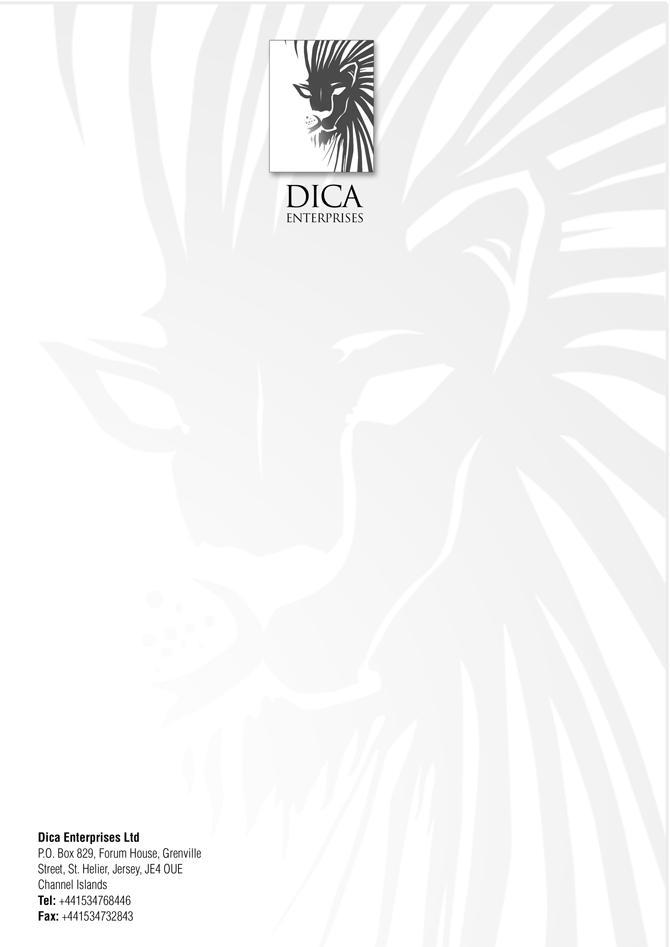
It is interesting to have something in the background of your letterhead, it could be your logo in a 10% tint or an image representing your product or service. However, all with moderation. The background should not be the most visible part of your letterhead, and should definitely not upstage the content of your letter, or even worse, make it unreadable.
Background
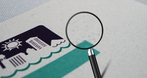
Beautiful business letterheads are printed on uncoated paper for ink-jet printing and ballpoint pen writing ease; the industry standard. There are many premium stocks available that include textured finishes to give your letterhead that extra oomph of professionalism.
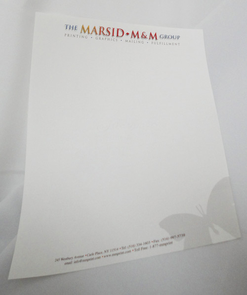
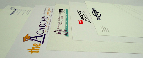
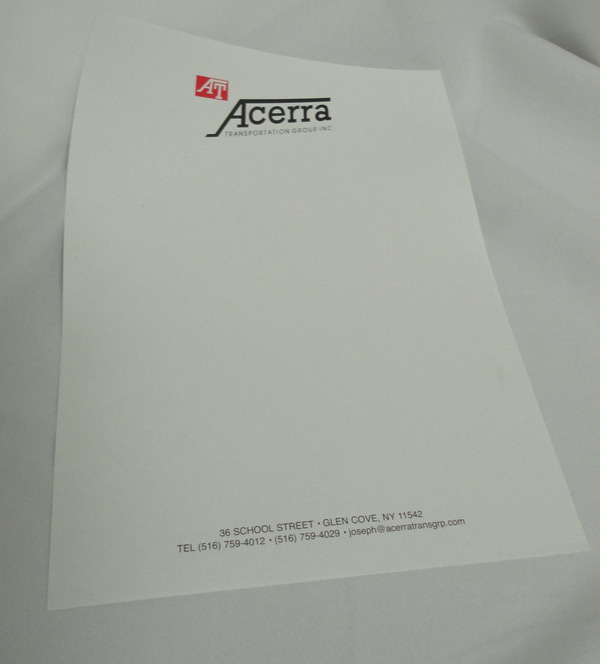
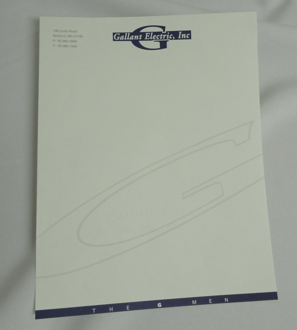
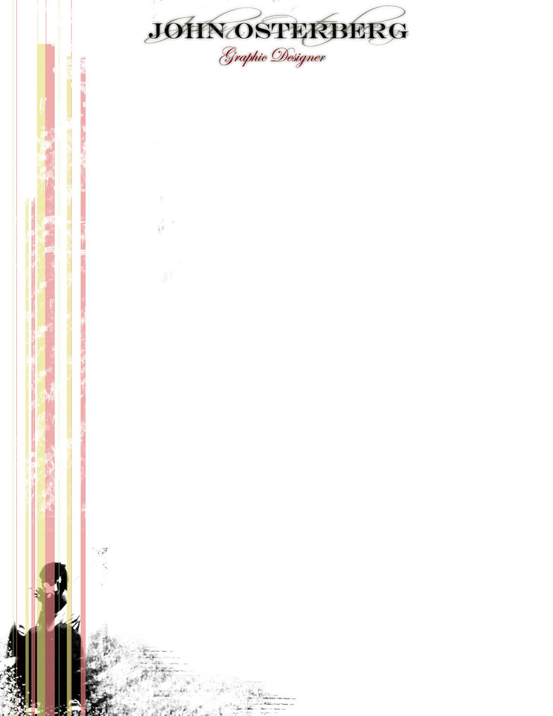
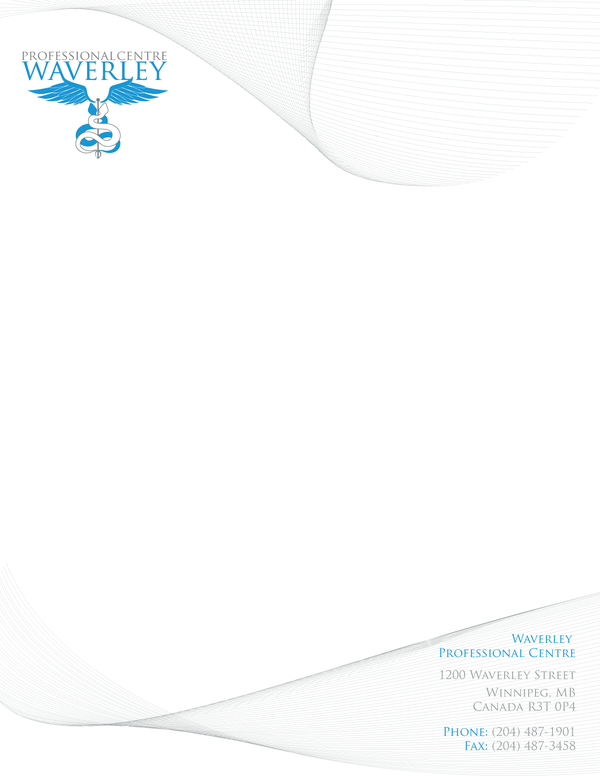
For inspiration, below are a few letterhead designs that stand out above the rest:
Are there any business letterhead designs that you would like to share?
Please share your comments with us below………


2 Comments
all9bouTpriNt01
August 14, 2012Thanks for the very nice post! That’s a very useful idea. I can use that. Thanks a lot!
demandprints
June 26, 2012Letterheads are the best way to attract customers. People used to use traditional simple and plain letterhead. But now people use colored and unique letterhead with the company name and logo.