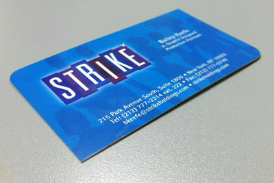
Business cards are more than just portable contact information; Designed properly, they can convey character and utility. When designing your business cards, it is important to consider the end-user.
- Who will be looking at them? (Design)
- Who will use them? (Information)
- How will they store them? (Finish)
- Will it go into a wallet or be digitally scanned? (Paper Stock)
All of these questions are utterly important to avoid your card being the one that gets disposed of because the information in it did not justify the bulk in the wallet, or because the lack of specificity did not remind customers of what the company does, or even because it is so overly simplistic that it gets lost among other ones. Keep all this in mind and find the right balance for a successful, informative, eye-catching business card worthy of retention.
The same applies when choosing your printing format
You want to be different, but not so different that confuses your clientele. Again, think whether you are catering to traditional customers who will expect a more traditional font and paper stock, or adventurous individuals who will appreciate your company having taken risks on the size, cut, material, and finishing. People want to identify… help them identify with your company. Going even further, you should consider using double sided cards. You want your business cards to be recognized from every angle, and you want to take advantage of the space. Sometimes it is smart to even include information that can help the customer in their daily lives. A calendar, a time/currency/metric system converter, a tiny bus/subway map —these can be great ideas, as long as you can make a connection with your company and why this tool was included. Do not just put it in because it is cool and useful; your customers will want it to make sense.
Paper stock makes all the difference
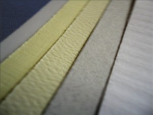 A great design can become a horrible one when the substrate it is printed on does not reflect the same quality.
Thickness (paper weight), gloss coated, un-coated, matte finish; Linen, Laid, natural white, solar white, textured or smooth? The paper stock can be considered part of the design process and choosing one is not as difficult as it may sound.
A few things to consider when choosing a paper stock for your business cards:
- Is my design contemporary or modern?
- a gloss paper gives colorful designs a more vibrant look
- textured stocks such as linen or laid convey elegance and are considered premium papers
- Paper colors and tones can have an effect on the colors in your design
Besides the aforementioned, paper mills produce an incredible line of paper types that can take your design above and beyond and increase the retention rate way past expectations.
The Finishing Touches
Some of you may be risk takers or outside-the-box thinkers; You like being different and you want your business card to express these features as well.
As we have seen above: options, options, options is all we have. Remember to choose the right combination of structure, colors, paper and last but not least, finishes. The wrong or unnecessary finish can ruin the beauty of a well designed and thought-out business card.
Here are a few of the most common finishes for your business cards:
Custom Die Cut
Standard shapes and completely custom cuts
Rounded Edges
Accent one, two, three or all four edges
Spot UV
UV coating in custom shapes
Free Resources:
- You can find Print-ready business card templates for many standard sizes by visiting our Business Card Templates page
- Make sure your files are print-ready by following our Print-Ready Checklist
What combinations have you used to make your business cards stand out?
Post your comments below…



6 Comments
James
July 3, 2024When selecting business card printing formats and paper stocks, balance uniqueness with audience expectations. Double-sided cards optimize space for essential info or practical tools, reinforcing brand identity effectively. Choose paper stocks that complement design for quality and appeal.
smart business cards uk
October 11, 2023When it comes to designing business cards, whether through traditional offset printing or modern digital methods, effectiveness is key. The design should reflect your brand identity clearly and concisely. Opt for a clean, uncluttered layout, with essential information like your name, title, contact details, and logo prominently displayed. Choose a font and color scheme that align with your brand. Incorporate high-resolution images and graphics for a professional look. Consider adding QR codes or clickable elements for a seamless transition to your digital platforms. Lastly, always proofread to ensure accuracy and eliminate any errors before printing.
Digital Printing
October 3, 2023This blog on Offset and Digital Business Cards is a game-changer! Packed with valuable tips for an effective design, it’s a must-read for anyone looking to make a lasting impression. The insights provided are practical and offer a great guide to creating business cards that stand out. Highly recommended for those seeking impactful design strategies!
Ivy Baker
March 10, 2020Getting good business cards printed does seem like a very important thing to do if you are a business owner. My sister is planning on opening a bakery by the end of October this year. I liked that you pointed out that she can get custom shaped cards printed. It would be fun if she could find a printer that could make her bread shaped business cards.
Andre Beluchi
April 13, 2016Seeing the style and looks of a digital business card, it seems like it would be a good idea to print some out. I guess passing out digital cards to the clients will a good strategy to use. Well, when printing these out, what type of design would attract the clients?
Dan
April 19, 2016Hi Andre, I would say that it depends on the industry you’re working in, and the message you are trying to get across. Some industries benefit more from a flashy, colorful design while others prefer a more conservative design.