As printers and print designers we are constantly submerged mentally and physically in the realm of CMYK. These four letters are the rule of the print industry and the basis for almost everything that we print. To increase your understanding of the CMYK color mode, please read our popular Colorful Guide to Understanding Color which explains color mode differences and why CMYK is used in printing while RGB is used for the web.
Corporate logo designers know very well that a complete logo design package requires both PMS and CMYK versions of a logo so that all advertising mediums such as print and web are covered. This has mostly to do with color consistency. CMYK values that represent the PMS version should be determined to keep this consistency throughout all marketing campaigns (not to mention RGB for web graphics).
As we grow as designers and printers, our love for the CMYK acronym grows and for those of you out there who know the feeling, we have come up with this collection of beautiful CMYK inspired vector logos from all over the world for your design inspiration:




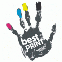

Source: Brands of the World
Notice that almost all of the CMYK inspired logos above are Print companies or have the word Print in them. As I said before, printers and print designers are CMYK fanatics!
What logos or other advertising have you noticed or designed that are CMYK inspired?
Please share your comments below…


1 Comment
Brookside Institute
May 31, 2011The accuracy limitations of CMYK printing are that the results can vary sometimes greatly depending on the range how it is calibrated and the particular color you are trying to print. There are also colors that cannot be reproduced using the CMYK process – such as metallic and very bright colors. Inevitably the colors shift when processed in CMYK and this could be a cause of the color out of spec youre experiencing.