When working with typography, it is necessary to implement the most appropriate typefaces in order to correctly convey an idea. The wrong typeface can create the wrong mood and mistake the purpose of the design. In the most extreme case, the wrong typeface can even ruin the design. That being said, there are quite a few factors that need to be considered before deciding which typefaces to use. When deciding which typeface is needed to properly accentuate a design, one must properly categorize and then use process of elimination. The two largest classifications of typefaces would be serif and sans-serif fonts.

A Little Bit of Serif History
Serifs are decorative accents on the end of strokes that make up each character. Serif fonts found their origin with the brush strokes used for creating early typefaces and eventually became standard.
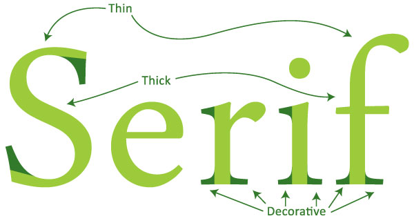
Below is an example outlining the two defining characteristics of serif fonts: the decorative accents and the changes from thick to thin strokes throughout the individual characters.

Serifs: Good for the Eyes
Serif fonts can sometimes be referred to as Roman fonts because the Roman Engravings and writings often have serifs. Serif fonts are more common in print and smaller sizes. The serifs are easily read and have been the standard for editorial copy. Serif fonts also are good for creating decorative designs or designs that need an older or more regal feel.

The Sans-Serif fonts have better readability on screen. Serif fonts have thick and thin strokes that can display unevenly on the screen causing parts that seem disproportionate and the readability in turn becomes impaired. Sans-serifs were traditionally used for accentuating type that needed to stand out because the strokes on sans-serifs are even while serif fonts have the thick and thin variation. Sans-serif fonts have had many names through their existence. The most common that still can be seen in some font names are “Gothic” and “Grotesque”.

Choosing between a serif and sans-serif is an important decision, but also is usually a simple one. If the designer knows how they want to convey an idea and where it will be displayed, they have already decided if the font should be a serif or sans-serif.


2 Comments
Annie
September 6, 2015Thanks man, this really helped me with my graphics homework 🙂
Giovanni
September 8, 2015You’re welcome! Glad it helped!