With the new year creeping up fast, it’s about that time to start thinking about your new calendar for 2016. With so many different options out there, it’s hard to narrow down exactly what kind of calendar to go with. Sometimes if you are ordering a large quantity, it may be worth it to go with a custom designed calendar for your office, team, organization or school. Everyone will love having a personalized calendar, and you have the freedom to make yours look and say whatever fits your project best.
The next tricky part is to pick the type and layout of your calendar. The standard size is 11″ x 8.5″ but there are plenty of other options you can choose to customize your calendar. Take a look at some of the following examples to spark your creativity for your 2016 calendar!
12″ x 12″ Square Calendars
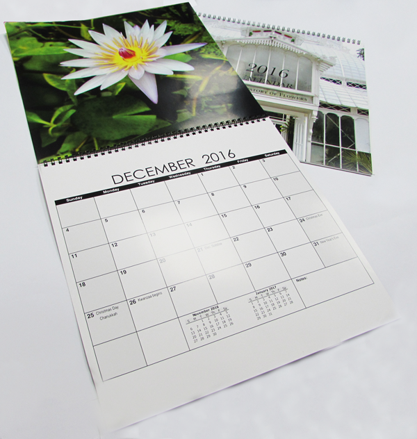
These prominent wall calendars are perfect to display in conference rooms, large offices or anywhere that could use extra large pages. These look really nice wire-bound which is also a plus because they can lay flat if notes need to be made or events added.
Small 8″ x 8″ Calendars
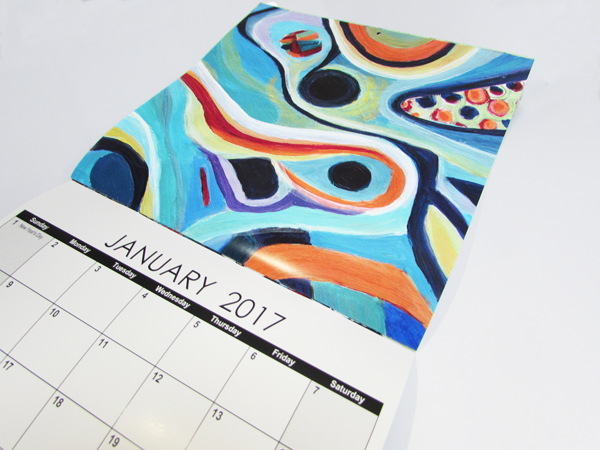
We recently had a customer print their watercolor artwork on a smaller version of a wall calendar. These are perfect for cubicles or small desks that don’t have a ton of space to hang full sized calendars.
Die-Cut Calendars
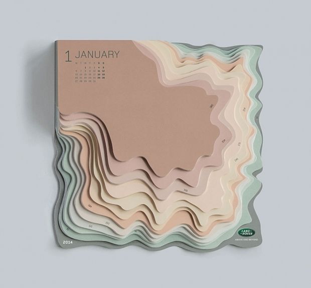
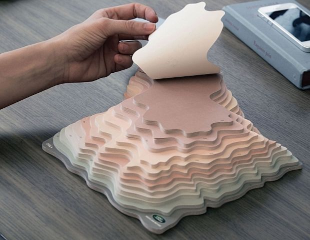
If you want something that really stands out, consider what Land Rover did with this custom die-cut design. They created a topographic map that could be peeled off day by day, mimicking layers of the earth. A calendar like this is so successful because it pairs functionality with brand accentuation. A calendar like this would be different for every company, but could serve as a great marketing tool.
Visualized Calendars
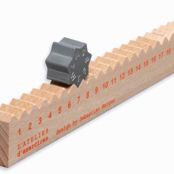
There is nothing says that says the days of the year have to be printed on paper. Visualized Calendars are a creative concept that can take on many different shapes and forms. Look for other media that can represent your calendar – it will attract more attention than a traditional day counter and can draw more notice to your brand. The calendar below uses a rack-and-pinion-like system that can easily be rolled to represent each day of the month.
Full Spread Calendars
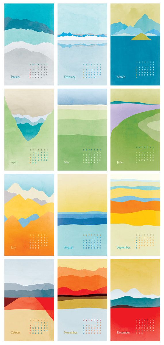
Most monthly spreads are set up to have a large picture at the top, and then a grid at the bottom representing all of the days of that month. This is used to write notes and add events to certain dates. In the digital age however, less people use physical calendars to schedule their lives. Instead, they will use their smartphones to plan their days and keep them better connected.
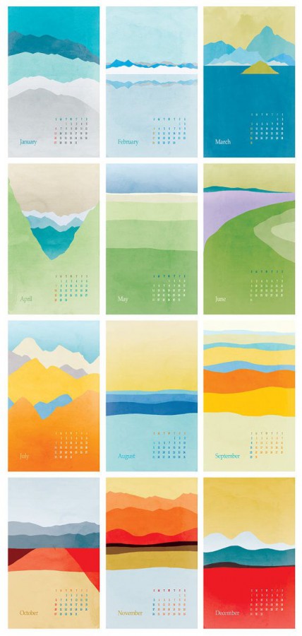
This doesn’t make the calendar obsolete though. The example above is a repurposed calendar that puts the focus on the artwork. Instead of splitting each page spread into two sections, they extended their artwork the length of the page and incorporated the calendar into the artwork. This design does not leave much room for someone to write on the display, but that is not always necessary. Instead, this layout plays to the aesthetic strength of the design.
Feel free to share your 2016 calendar ideas in the comments below, or head over to mmprint.com to get a quote for your calendar printing!
Leave a Reply