Lookbooks seem to be the latest craze for fashion start-ups and clothing lines. I can attest to this statement because it’s been our hottest selling product for the 3rd and 4th quarter of 2013 and probably would have been for longer than that… had we paid more attention to this trend earlier in the year.
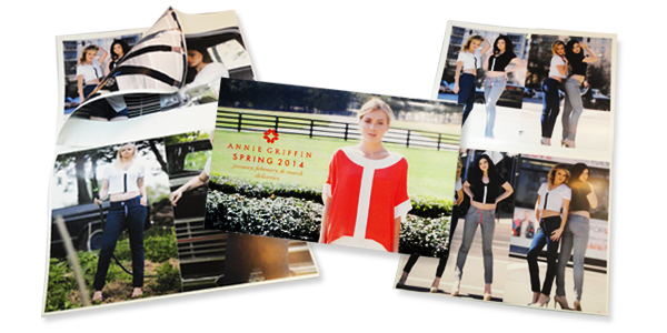
The difference between a lookbook and a catalog is in the content. Lookbooks showcase your fashion/clothing line’s look and style and doesn’t get into too much detail because it’s all about imagery, hence the name “Look” book.
A lookbook design sets the stage for your target market and with these tips you will be able to create an environment that they can relate to and see themselves in it.
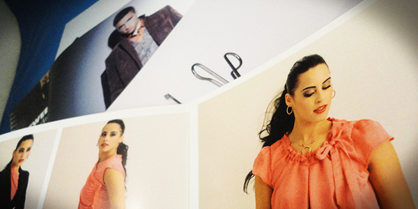
Simple and Subtle Imagery
Lookbooks are made for looking. Simple as that. No need to create distraction with overwhelming amounts of text or disruptive graphics that take the focus away from your product.
You may opt for a solid color background usually gentle whites or light greys that contrast with the colors of your models and clothing. Even shadows can draw the eyes away from the target, make sure your lighting conditions are optimal.
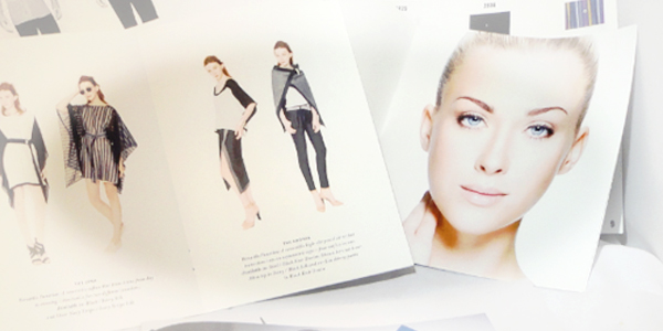
Use Your Environment
For the seasonal or niche fashion-eers, the background can be used to your advantage. Create a habitat where your fashion lives, where you target market finds themselves. Help them envision how your style fits their lifestyle.

Gloss, Gloss… Gloss.
The paper you select for your lookbook printing can really influence the outcome. In my opinion, nothing makes photographs POP like a glossy finish, the good news is most small runs of lookbooks are printed digitally…
Digital printing uses toner which has a glossy finish anyway so basically you can print on uncoated or matte paper and still have a glossy finish. I’ve seen this used to give the printed areas a 3D type effect or can be comparable to Spot UV coating.
1 Comment
Hannah Chan
May 9, 2022Very Awesome and Help full Article. It really helps me. thanks for sharing this